Giving the Trip Page its rhythm back
I redesigned the participant-facing Trip Page to create clearer hierarchy, more visual depth, and a better way to explore a trip before joining.
Timeline
6 weeks
Team
Solo Product Designer · PM · 3 engineers
Product area
B2C / Trip Discovery
PROJECT
Creating consistency without losing context
Patterns from our simpler, structured Itinerary experience had been extended to the Trip Page. While consistent, they didn’t fully support a page meant to help travelers explore and evaluate an experience.
Outcome
The redesign gives different types of content the space and visual weight they need, creating a more varied and intentional flow across the page.
The experience is currently moving through implementation and validation.
PROBLEM
When consistency became too uniform
Feedback pointed to the same themes:
Flat hierarchy · Long scrolling · Similar-looking sections · Lack of depth
The Itinerary was built to organize information. The Trip Page also needed to inspire and help travelers evaluate the experience.
The existing experience revealed a long, visually repetitive content flow.
Understanding what deserved attention
DISCOVERY
I combined benchmarking with real product data to understand how sections should be structured and prioritized.
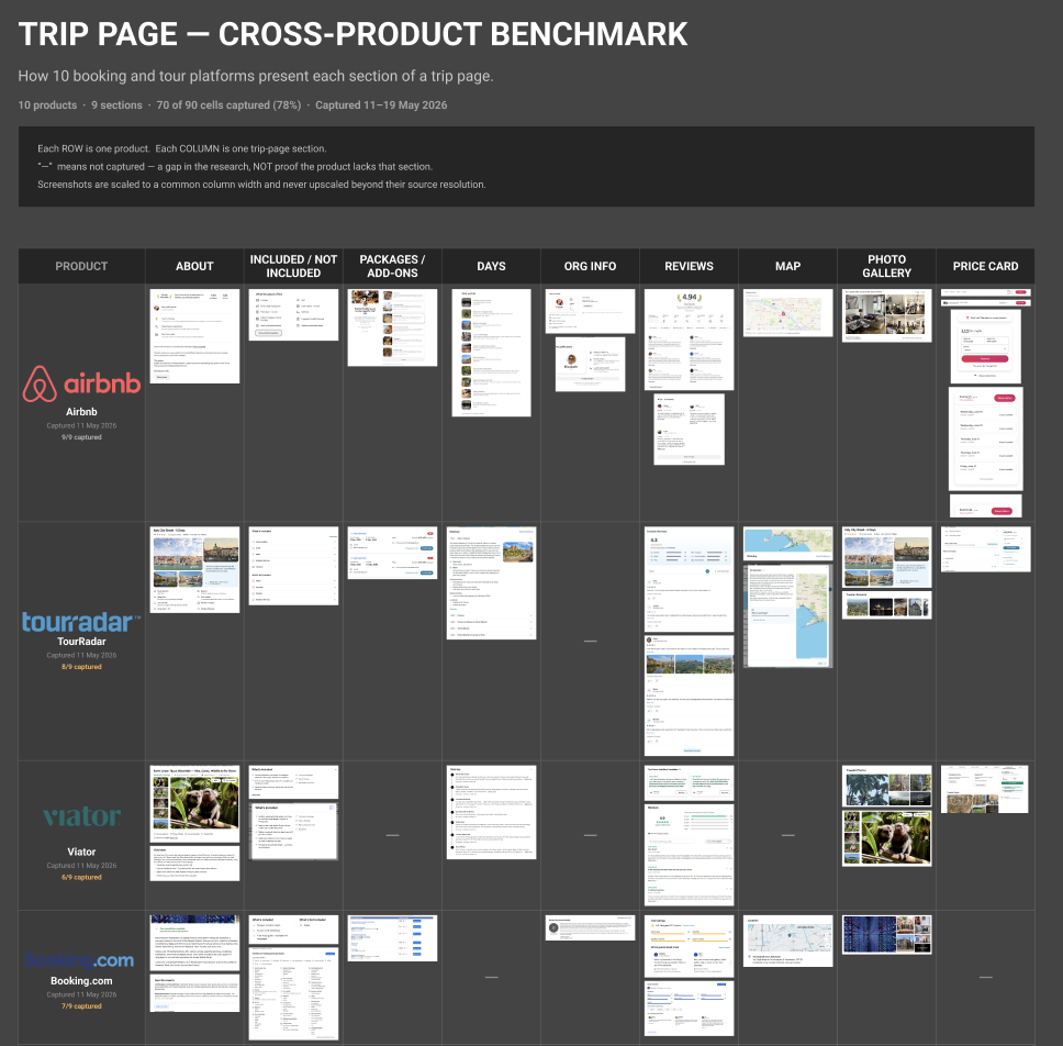
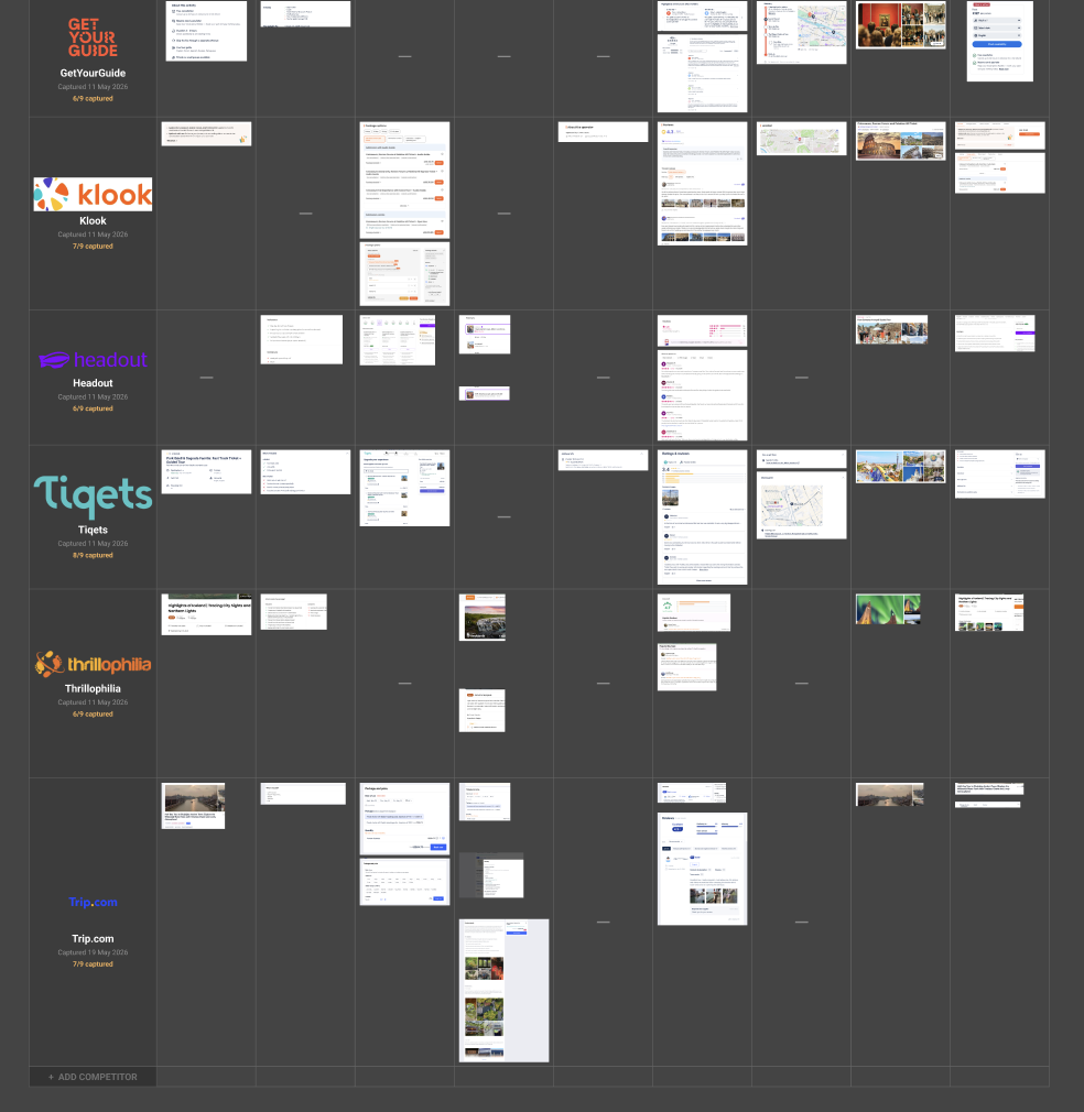
The key insight
The problem wasn’t the amount of content. It was how everything competed for attention.
Hierarchy · Grouping · Content length · Usage · Visual emphasis
IDEATION
Finding the rhythm
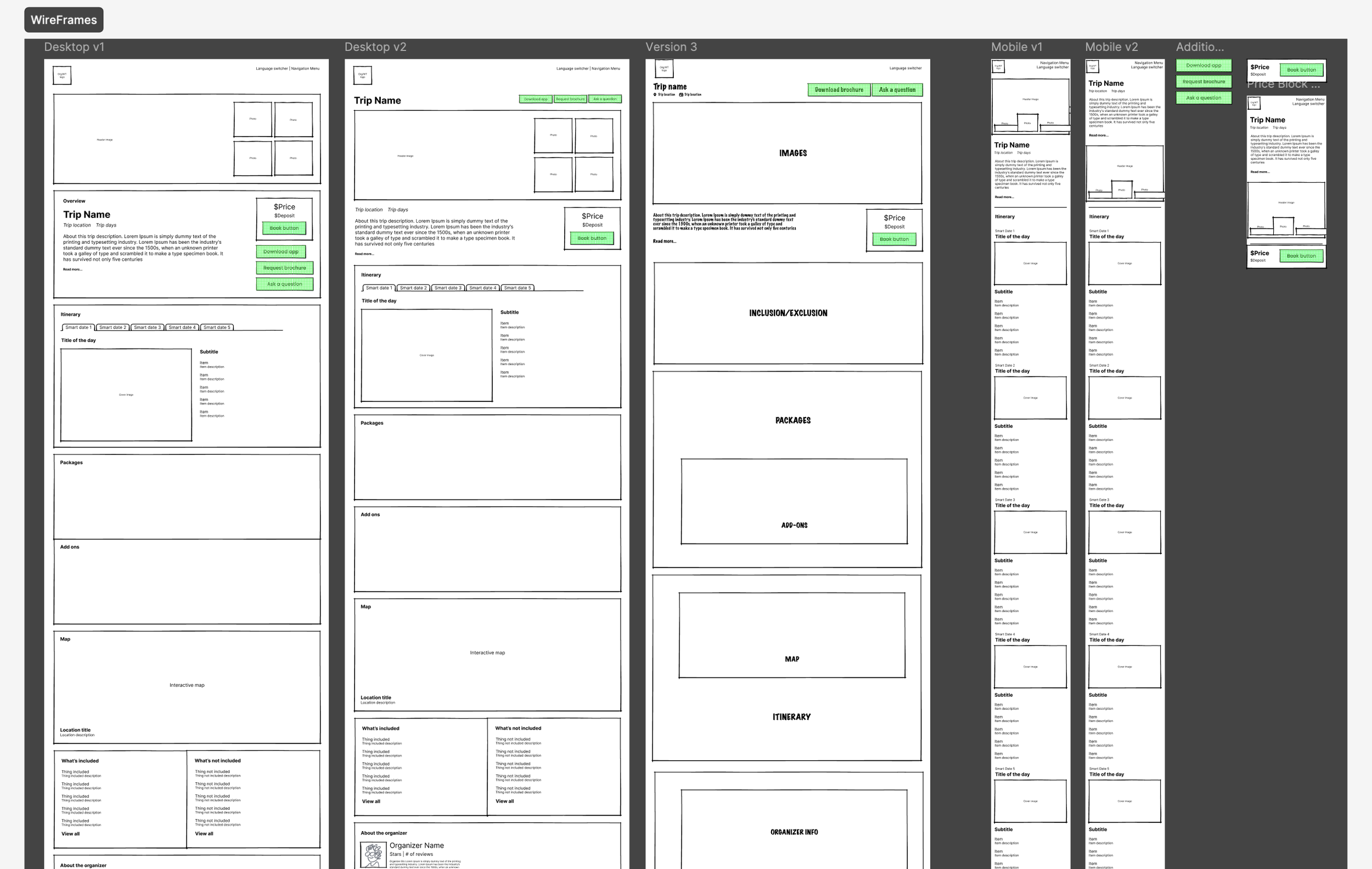
I explored different ways to create hierarchy and variation across a long, content-heavy page.
Song analogy
I started thinking about the page like a song: without pauses, variation, or emphasis, everything becomes one continuous note.
DESIGNS
From repetition to rhythm
The final direction uses changes in layout, imagery, spacing, and visual weight to create natural moments of focus and pause throughout the page.
LESSONS
What I took from the project
Consistency doesn't mean uniformity.
Different product contexts need different levels of visual expression.
Real content and usage data are as important as visual benchmarks.
Good long-form experiences need rhythm, not just structure.